
On the National Economics Challenge (NEC), income-distribution questions reward students who can do three precise things: read a Lorenz curve, interpret a Gini coefficient as a 0–1 number, and reason about the equity–efficiency trade-off when a redistribution policy is proposed. This guide drills exactly those measurement tools and the policy logic that surrounds them — not growth or wages, but how inequality is measured and acted on.
Why distribution is its own NEC topic
The NEC, run by the Council for Economic Education (CEE, founded 1949), spans microeconomics, macroeconomics, and the world economy across roughly 10,000 US students a year. Distribution sits awkwardly between the first two: a market can be perfectly efficient at the macro level and still leave a deeply unequal split of income. That gap is precisely what examiners probe. A question rarely asks “is inequality bad?” — that is an opinion. It asks you to measure the gap with a defined instrument and then evaluate a policy against a stated objective.
This makes the topic unusually scoreable. The vocabulary is finite (Lorenz, Gini, quintiles, progressive vs. regressive, transfers), the diagram is standard, and the trade-off framework is reusable. A student who treats distribution as a measurement-and-policy module — rather than a values debate — tends to convert it reliably. For the broader question of how inequality interacts with a country's development and living standards, see our companion piece on development economics; here we stay on the measurement instruments themselves.
The Lorenz curve: reading the picture
A Lorenz curve plots the cumulative share of total income (vertical axis) against the cumulative share of the population, ranked poorest to richest (horizontal axis). Both axes run 0% to 100%. The 45-degree diagonal is the line of perfect equality: if the bottom 40% of people earned exactly 40% of income, the curve would sit on the diagonal.
In reality the curve bows below the diagonal, because lower-income groups hold a smaller-than-proportional share. The further the curve sags from the diagonal, the greater the inequality. Two practical reading skills earn marks: (1) translate a point — “the bottom 60% of households receive 30% of income” is a single coordinate; and (2) compare two curves — the one lying further from the diagonal everywhere is unambiguously more unequal.
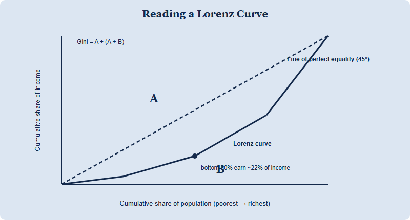
The Gini coefficient: turning the picture into one number
A diagram is hard to rank precisely, so economists collapse it into the Gini coefficient. Geometrically it is the area of the gap between the diagonal and the Lorenz curve (region A above) divided by the entire area under the diagonal (A + B). The result is a single value between 0 and 1 (sometimes reported 0–100 as a “Gini index”):
- 0 (or 0) — perfect equality; everyone has the same income, the curve sits on the diagonal.
- 1 (or 100) — perfect inequality; one person holds all income, the curve hugs the bottom and right edges.
- Higher value = more unequal. Moving from 0.30 to 0.45 means the distribution has become more skewed.
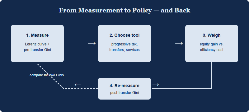
Two examiner-favourite nuances separate strong answers. First, the Gini is a summary statistic: two very different distributions can share the same Gini, so it can hide where in the spectrum inequality sits. Second, pre-tax/pre-transfer Gini and post-tax/post-transfer Gini differ — the fall between them measures how much a tax-and-benefit system actually redistributes. Naming that distinction is often the single most valuable sentence in a distribution answer.
| Measure | What it shows | Range / form | Key limitation to flag |
|---|---|---|---|
| Lorenz curve | The full shape of the distribution | Curve from (0,0) to (100,100) | Hard to rank precisely when two curves cross |
| Gini coefficient | Inequality as one number | 0 to 1 (or 0–100 index) | Different distributions can share one Gini |
| Quintile / decile ratio | Top group's income vs. bottom group's | A ratio, e.g. 80/20 share | Ignores the middle of the distribution |
| Poverty rate | Share below a defined income line | A percentage | Says nothing about inequality above the line |
Equity vs. efficiency: the policy trade-off
Once inequality is measured, the NEC pivots to policy — and the governing idea is the equity–efficiency trade-off. Equity concerns fairness in how income is split; efficiency concerns producing the most output from given resources. Redistribution can improve equity, but several channels may dent efficiency, and an examiner expects you to name them rather than assert a verdict:
- Incentive effects. High marginal income-tax rates may weaken the incentive to work extra hours, train, or take risks — the classic efficiency cost.
- The "leaky bucket." Administering taxes and transfers consumes resources, so not every dollar taxed reaches the intended recipient.
- Behavioural responses. Means-tested benefits can create a “benefits trap” where extra earnings are clawed back, blunting the reward for working more.
Crucially, the trade-off is not always binding. Education and healthcare spending can raise equity and long-run efficiency by building human capital; correcting a market failure can do both at once. A top-band answer states the tension, then tests whether a specific policy actually faces it. That conditional reasoning — “it depends on the design and the elasticity of response” — is what distinguishes economic analysis from assertion.
How distribution shows up across the seven rounds
The NEC is contested in three divisions — Pre (entry; individual or a team of 2–4), David Ricardo (intermediate; team of 4), and Adam Smith (advanced; team of 4) — across seven rounds: the Qualifying Test, Super Econ, Quiz Bowl, Critical Thinking, Econ Lab, Econ Immersion, and U20 Youth Voice. Distribution content surfaces differently in each, so calibrate your prep to the format rather than memorising one mode.
- Qualifying Test & Quiz Bowl: fast recall — what the Gini measures, what a Lorenz curve's axes are, progressive vs. regressive tax. Speed and precise definitions win.
- Critical Thinking & Econ Lab: applied case work — interpret a Gini change, evaluate a redistribution proposal, name the equity–efficiency trade-off with conditions.
- Super Econ & U20 Youth Voice: synthesis — connect a distribution argument to taxation, market failure, or macro policy, and defend it under questioning.
Always confirm the current round formats, division rules, dates, fees, and awards on the official channels before you build a study plan — competition structure can change year to year. As the officially authorized China National Round, CNEC (China National Economics Challenge) is run by Hanlin (SKT) and operates across 20+ provinces and 300+ schools as the only official path from China to the NEC global rounds. You can check the current cycle on the CNEC home page.
A four-week drill for the distribution module
From running the CNEC round, one pattern is clear: students lose distribution marks not on the policy debate but on the mechanics — mislabelling a Lorenz axis, or describing the Gini as “the area under the curve” instead of the ratio. Front-load the mechanics, then layer policy.
- Week 1 — Draw it: sketch Lorenz curves from quintile tables by hand until axes and bowing are automatic.
- Week 2 — Quantify it: practise reading Gini values and explaining what a 0.05 rise means in plain English.
- Week 3 — Compare it: work pre- vs. post-transfer Gini cases; state how much a policy redistributed.
- Week 4 — Argue it: for each redistribution tool, write the equity gain, the efficiency cost, and the condition under which the trade-off does or does not bind.
FAQ
Is a higher Gini coefficient always worse?
No — it signals more inequality, but “worse” depends on your objective. The NEC rewards measuring it, not value-judging it.
What is the difference between a Lorenz curve and the Gini?
The Lorenz curve is the full picture of the distribution; the Gini is that picture compressed into one 0–1 number.
Does redistribution always reduce efficiency?
Not necessarily. Human-capital spending can raise equity and long-run efficiency together; the trade-off depends on policy design.
How much distribution maths does the NEC need?
Mostly interpretation: read curves and Gini values and reason about policy. Confirm the exact emphasis on the official CNEC channels.
Published by the NEC / CNEC editorial desk, operated by Hanlin Education as the officially authorized China National Economics Challenge (CNEC) test center. The NEC is run by the Council for Economic Education, which sets the official rules — always confirm current dates, divisions, fees, and awards on the official CNEC channels. Any errors are corrected within 7 working days.